In our last post we discussed the value of implementing yard signs into your marketing campaign. These affordable and effective signs, are great for spreading your message around town. Although cost and placement are important factors, the messaging and design of the sign are equally important. When designing or planning out your design for yard signs, we have a few tips that will help you get the most from your signage.
1. Less is more! Keep in mind that you are trying to convey the most important part of your message to potential customers and generate leads. A logo or service description with a website or phone number are more than enough. Don’t add small text that is hard to read. Your real estate on the sign front is limited, only include what is necessary. You want readers to take in the most important information as quickly as possible.
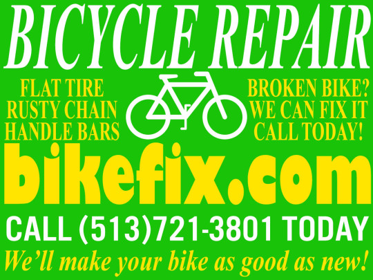
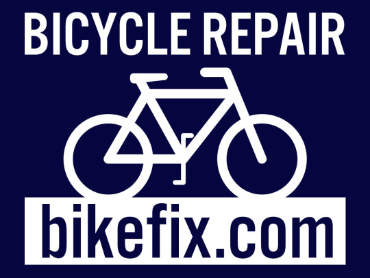
2. Clear Messaging. Use a popular service or call to action to get the reader’s attention. Let’s say you fix bikes and need to advertise your shop. Adding “Bicycle Repair” and your website keeps your messaging simple and direct. Once a customer contacts you or visits website, you can begin informing them about the additional services you offer.
3. Color is Key. Choosing contrasting, or complimentary colors, (i.e. black & white or dark purple & yellow), will allow for your information to stand out and be legible. Try using a dark color as your background and a light color as your font, or vice versa. This will help separate your information from the body of the sign and make the design more eye catching.
4. Fonts for the Win. Using Sans Serif fonts, like Arial, Futura and Impact, can help increase the legibility of your sign. Fancy script and serif fonts may look great on your computer screen, but they can make your sign difficult to read and dilute the effectiveness of your signs. A simple and bold font will make your message clear. Visit our Fonts & Typography page for some great Free & Commercial font libraries to use in your design.
5. Open Space. You do not want to overfill your sign. Having around 30-40% of your design area, or canvas, as open space allows your message to be easier to read. Overcrowding your canvas can make your sign difficult to read. The harder to read, the less impact your sign is having. Remember, your sign’s main objective is to be informative.
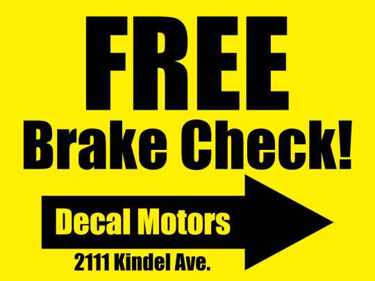
6. Lead the Way! Adding an arrow to your sign, can help direct customers directly to your shop, open house, or restaurant. If you add an arrow to your sign, the sign’s placement around your location is even more important. This technique only suggested if you are trying to get more visits to your shop.
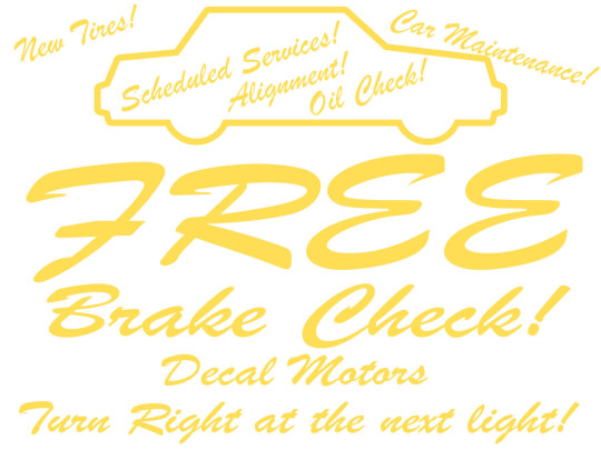
EXAMPLES:
Below are a few mock examples of Good and Bad yard sign design examples.
Bad – Too many colors, too many fonts, colors do not contrast, too much text, no open space
Good – Simple, easy to read font, contrasting colors (blue & white), open space makes sign more legible
Bad – Font is difficult to read, yellow does not contrast well with white, too much information.
Good – Contrasting colors makes sign legible, bold font choice is easy to read in open space, arrow clearly directs customers toward store front.